
Menu
Choosing Furniture Colors: Psychological Influences and Effects
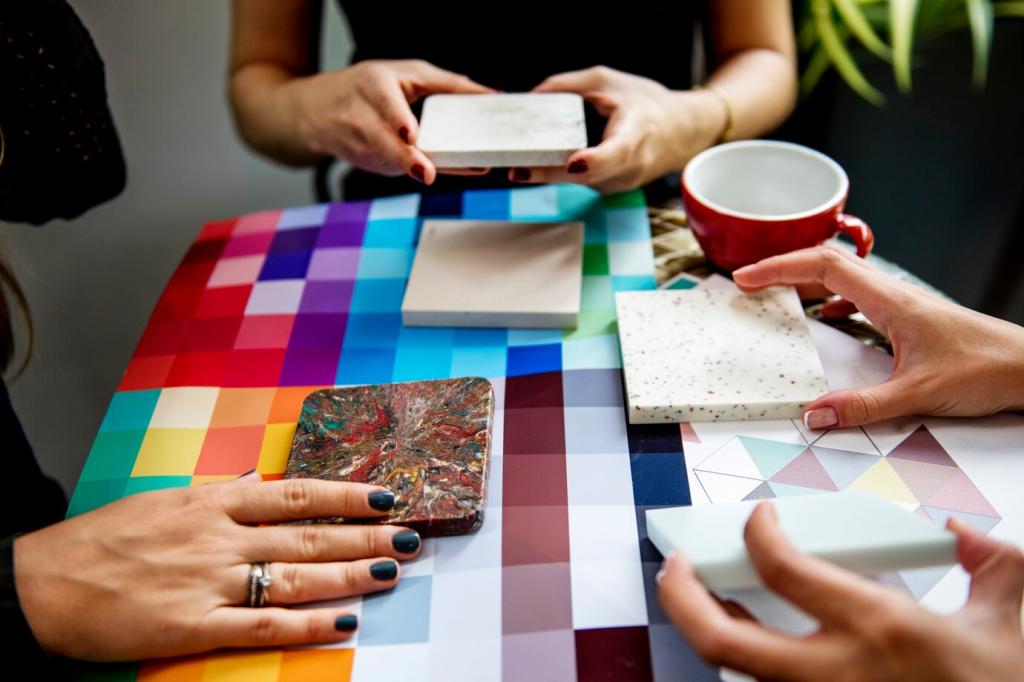
Selecting the perfect color for your furniture goes beyond matching your decor or following trends; it delves into the realm of psychology. Colors have a profound impact on our moods, perceptions, and even behavior. When choosing furniture colors, understanding the psychological influences and their effects can help you create spaces that are not only visually appealing but also supportive of the atmosphere and energy you want to cultivate in each room. This guide explores the key psychological considerations that should inform your choices, empowering you to design interiors that enhance both style and well-being.
Calming Effects of Cool Colors
Cool colors such as blue, green, and soft purples are renowned for their ability to evoke calmness, serenity, and relaxation. These hues tend to reduce stress and promote a sense of peace, making them ideal for furniture in bedrooms, living rooms, or other areas designed for unwinding. Blue tones, for example, have been shown to lower blood pressure and slow breathing, which is why they are frequently chosen for sofas, armchairs, and bedding. Green, reminiscent of nature, brings balance and restfulness, contributing to mental clarity and emotional equilibrium. Integrating these cool shades into your furniture can help transform your home into a tranquil retreat.
Energizing Warm Tones
Warm colors—including red, orange, and yellow—inject energy and vibrancy into interiors. Choosing furniture in these hues can invigorate a room, stimulate conversation, and enhance feelings of excitement or happiness. Red, a bold choice for statement pieces like chairs or ottomans, is associated with passion, enthusiasm, and appetite, making it popular for dining rooms or entertainment spaces. Yellow is often linked to optimism and creativity, brightening up workspaces or kitchens. When skillfully used, these lively colors can awaken the senses and turn everyday spaces into dynamic hubs of activity.
The Versatility of Neutral Shades
Neutral colors such as white, gray, beige, and taupe are celebrated for their versatility and timeless appeal. While they might not elicit strong emotional responses like vibrant colors, neutrals provide a harmonious backdrop that can ground a space and create a sense of order. Neutrals are especially effective for larger furniture pieces, offering flexibility to change accent colors through accessories or artwork. They also help open up smaller rooms, making spaces feel more expansive and inviting. Opting for neutral furniture allows you to experiment with other colors in your decor while maintaining a sophisticated core palette.
Cultural Symbolism of Colors
Different cultures attribute various meanings to colors, influencing how they are interpreted in interior spaces. For instance, while white might denote purity and cleanliness in many Western cultures, it can signify mourning in certain Eastern traditions. Red may symbolize luck and celebration in one context and caution or danger in another. When selecting furniture colors, it’s valuable to reflect on these cultural nuances, especially in diverse households or for those who wish their decor to reflect their heritage. Incorporating culturally meaningful colors can help strengthen emotional connections within a home and honor its occupants’ backgrounds.

Personal Memories and Associations
Beyond cultural meanings, personal experiences play a significant role in color preferences. A particular shade of blue might remind you of childhood summers, while a rich mahogany could evoke memories of a grandparent’s home. These associations can make certain colors especially comforting or inspiring when used in furniture. Interior settings become even more meaningful by selecting shades that resonate on a personal level, ultimately transforming houses into unique, cherished sanctuaries that tell the stories of their inhabitants through their color choices.
Practical Considerations and Psychological Well-being
Enhancing Focus and Productivity
Certain colors can improve concentration and productivity, making them smart choices for study areas, home offices, or creative studios. Greens, associated with growth and renewal, help reduce eye fatigue and increase attention span. Subdued blues also support calm focus by reducing mental clutter and promoting clear thinking. Choosing furniture in these shades for work-related spaces can subtly facilitate better work habits and improved performance, making the environment both comfortable and conducive to success.
Supporting Restful Relaxation
Bedrooms and relaxation zones greatly benefit from calming, muted colors that signal the mind to wind down. Shades of soft gray, pale blue, lavender, and creamy neutrals can all promote restfulness, making them ideal picks for beds, nightstands, and lounge chairs. These gentle colors lower psychological arousal, cueing the body that it’s time to rest. Thoughtful use of these hues helps optimize sleep quality and contributes to overall wellness by providing a sanctuary away from daily stresses.
Creating Social and Inviting Spaces
If the goal is to foster socialization, warmth, and togetherness, choosing the right furniture color is key. Orange and yellow tones encourage friendliness and conversation, creating a welcoming vibe for family rooms and dining areas. Deep, rich hues like burgundy or emerald can also add a touch of sophistication while still feeling inviting. The psychology behind these colors supports open interaction and comfort, making it easier for guests and family members to feel at ease.