
Menu
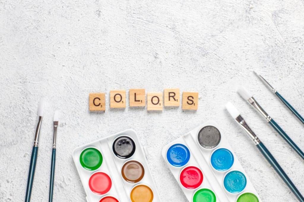
Impact of Color Psychology in Furniture Design
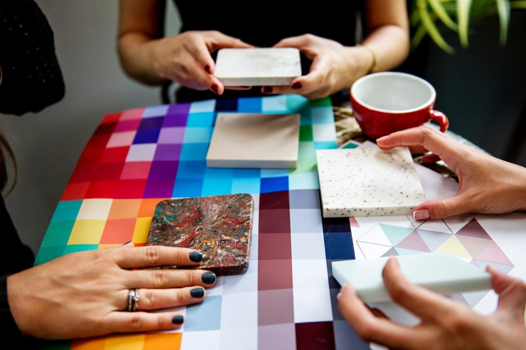
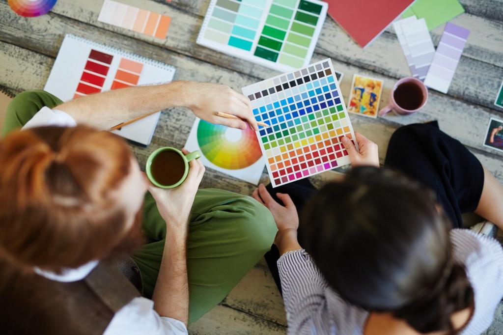
The psychological impact of color is an integral aspect of furniture design, influencing not only aesthetic preferences but also emotional responses and behaviors within a space. Designers and consumers alike are increasingly aware of the subtle yet powerful effects color can have on mood, perception, and even productivity. As modern interiors prioritize both function and atmosphere, understanding the connection between color psychology and furniture design becomes essential. This exploration reveals how color choices in furniture shape experiences in homes, offices, and public environments, making color an influential tool in the hands of designers.
The Emotional Influence of Colors in Furniture
Cool colors such as blue, green, and soft purples are widely employed in furniture design to create tranquil and refreshing environments. These tones are often associated with serenity and relaxation, making them ideal for bedrooms, lounges, and therapy spaces. By introducing cool-colored furniture, designers can establish a peaceful retreat from the stress of everyday life, facilitating calm reflection and restful breaks. The psychological effect of these hues extends to lowering stress levels and fostering a harmonious atmosphere, making them a popular choice for settings where restorative experiences are paramount.
Every culture brings unique symbolism to color, shaping emotional responses and expectations. For instance, red may signify luck and celebration in some Asian cultures while symbolizing caution or passion elsewhere. Furniture designers working globally need to respect these diverse meanings to achieve harmony with local sensibilities. Careful color selection acknowledges these differences, ensuring that products are not only visually appealing but also culturally appropriate, bridging traditions and modernity through thoughtful design decisions.
Color preferences evolve in step with social trends, societal attitudes, and popular culture. Influences such as fashion, art movements, and global events can drive shifts in which colors are favored in furniture design. Designers must stay attuned to these dynamics, as the colors that resonate with consumers can reflect broader societal moods—such as a turn toward soothing pastels during uncertain times or bold statements during eras of optimism. Understanding these trends enables furniture brands to create products that feel contemporary and relevant, fostering deeper connections with their audience.
Throughout history, the use of color in furniture has often indicated social status, wealth, or exclusivity. Rich, vibrant colors have traditionally been associated with luxury and opulence, while more subdued shades denote simplicity and modesty. In modern design, these associations continue to influence perceptions, with certain colors signaling prestige or sophistication. Designers tap into these subconscious cues, selecting colors that align with a brand’s positioning or a client’s aspirations, subtly communicating social narratives through the very hues of their creations.
The Impact of Color on Spatial Perception
Light colors in furniture are often chosen to create the illusion of a larger, airier space. Pale shades of white, beige, and pastel tones reflect more light, making rooms feel open and less confined. This technique is particularly valuable in small apartments, offices, or spaces with limited natural light, where maintaining a sense of openness is crucial. By introducing light-colored furniture, designers help reduce feelings of overcrowding, improve visual flow, and foster an environment that feels inviting and empowering.
On the opposite end of the spectrum, dark-colored furniture such as deep blues, rich browns, or charcoal can introduce a sense of intimacy and coziness. These shades absorb light and visually contract the space, making large rooms feel more contained and comfortable. Designers often employ darker furniture to establish zones of relaxation or focus, especially in expansive living areas or open-plan homes. The psychological impact is a soothing embrace, inviting occupants to unwind and enjoy the enveloping atmosphere crafted by the furniture’s color depth.
The use of bold contrasts—combining light and dark, complementary, or opposing hues—can create dramatic visual effects that shape perception. Contrasting colors in furniture design draw the eye, define boundaries, and introduce a sense of movement or rhythm within a space. Designers use these techniques not just for aesthetic excitement but to guide movement and interaction, subtly influencing how people navigate and utilize their environments. Through skillful color contrast, even the most complex spaces can become visually coherent and engaging, optimizing both design and function.
Color Psychology and Brand Identity in Furniture Design
Establishing Unique Brand Signatures
Every successful furniture brand aspires to be instantly recognizable, and color plays a crucial role in achieving this aim. Signature color schemes become synonymous with a brand’s ethos, whether the minimalism of Scandinavian white and wood tones or the exuberance of bold Italian reds and golds. By embedding specific color palettes into product lines and marketing, brands create a cohesive identity, fostering loyalty and trust among consumers who draw comfort and inspiration from familiar visual cues.
Communicating Brand Values Through Color
Brands can reinforce messages about sustainability, innovation, luxury, or accessibility through the colors they choose for their furniture. Earthy greens and browns may suggest environmental consciousness, while metallics and deep hues can imply sophistication and exclusivity. Designers align color choices with core brand narratives, ensuring that each piece of furniture not only serves a practical function but also tells a story aligned with company values. This application of color psychology elevates everyday items into powerful communication tools.
Consumer Perception and Purchase Decisions
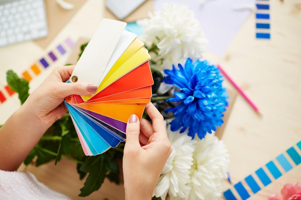
The initial attraction a consumer feels toward a piece of furniture is often based on color. Studies in color psychology demonstrate that shoppers form opinions within seconds, and color plays a substantial role in that first impression. Brands and designers leverage this instinctive reaction by carefully curating colors that tap into target demographic preferences and expectations. By doing so, they drive consumer engagement, encourage exploration, and ultimately influence purchasing decisions, using color as an essential bridge between product and consumer.
Advancements in Color Technology and Materials
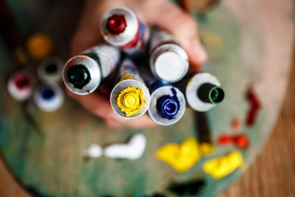
The introduction of advanced dyes and pigmentation techniques enables furniture designers to achieve richer, more stable colors across diverse materials. Innovations such as UV-resistant coatings, eco-friendly dyes, and colorfast finishes ensure that furniture maintains its vibrancy and appeal over time. This technological leap allows for bold experimentation, liberating designers from the constraints of traditional color limitations, while also addressing environmental concerns and expanding creative freedom.
Psychological Effects of Color in Workspaces
01
Stimulating Productivity with Bright Colors
Bright and invigorating colors such as yellows, oranges, or certain greens can help stimulate alertness, creativity, and energy in the workplace. Integrating brightly colored furniture into offices encourages active participation, idea generation, and a sense of enthusiasm. Designers use these tones to liven up meeting spaces, breakout areas, and collaborative zones, where higher levels of engagement and innovative thinking are prized. The psychological boost from these colors helps drive motivation and productivity, turning ordinary workspaces into vibrant centers of achievement.
02
Facilitating Focus with Muted Tones
Muted and subdued palettes, including soft blues, gentle grays, and understated whites, are often employed in office furniture to foster concentration and reduce distractions. These shades help create a calm, orderly atmosphere, ideal for tasks that require sustained focus and mental clarity. By limiting visual overstimulation, designers support individuals in maintaining attention on their work, minimizing stress and fatigue. Careful use of these soothing colors in workspaces translates into improved performance and a more pleasant daily working environment.
03
Supporting Well-Being with Nature-Inspired Hues
Biophilic design principles highlight the importance of incorporating nature-inspired colors into furniture to support wellness in the workplace. Greens, earthy browns, and other organic tones evoke the calming qualities of the outdoors, helping to lower stress and enhance overall well-being. Furniture designed in these colors nurtures a connection to nature, even in urban or high-rise offices, contributing to psychological comfort, reduced absenteeism, and higher employee satisfaction. This application of color psychology is increasingly recognized as essential for holistic workplace design.
Influence of Pantone and Industry Leaders
Institutions such as Pantone play an influential role in defining color trends that ripple through design industries worldwide. The announcement of a “Color of the Year” often leads to its rapid adoption in furniture collections, prompting designers and manufacturers to incorporate these trending hues into their offerings. The authority of industry leaders in highlighting specific shades helps unify market direction, while also challenging designers to reinterpret these colors in fresh, compelling ways that inspire consumers.
Shifting Palette Preferences
Color trends are cyclical, often reflecting current societal interests or collective moods. Pastels can dominate during periods of nostalgia or recovery, while bold, saturated colors may prevail in times of optimism or radical change. Designers monitor shifts in palette preferences, adapting their collections to suit emerging consumer sentiments. This agility ensures ongoing relevance, enabling brands to maintain a close rapport with audiences eager for on-trend, visually appealing furniture that feels timely and appropriate.