Menu
Understanding Color Psychology in Home and Office Furniture Design
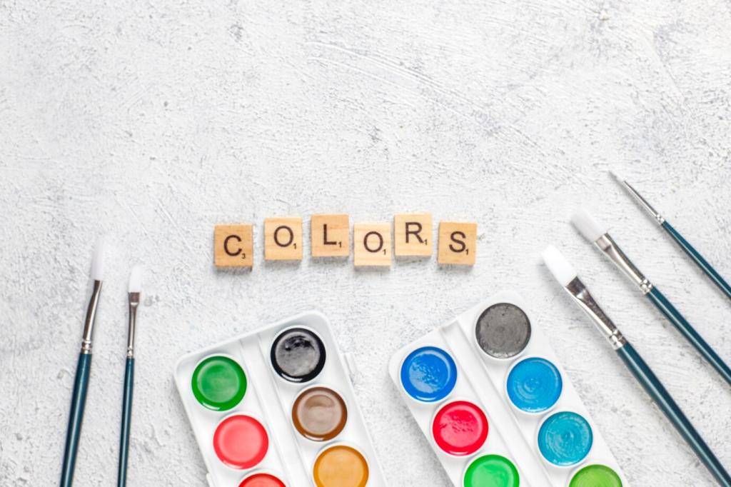
Color psychology plays a pivotal role in shaping our perceptions, behaviors, and moods within any environment, especially in places where we spend significant time like homes and offices. The choice of color in furniture design extends beyond aesthetic appeal; it deeply influences comfort, productivity, sociability, and relaxation, catering to specific emotional needs. By exploring how different hues impact our psychological well-being, we can make informed decisions when selecting furnishings that enhance interior atmospheres and support intended purposes, whether it’s fostering creativity in a modern office or ensuring tranquility in a living room retreat.
The Psychology of Colors in Interior Spaces
Influence of Warm Colors
Warm colors such as red, orange, and yellow are known to evoke feelings of energy, enthusiasm, and warmth. In the context of home and office furniture, these hues are often used to stimulate conversation or boost motivation. For instance, a red statement chair or orange-accented office lounge may encourage social engagement among team members. While they can invigorate a space, overuse may lead to overstimulation, so these shades are best used thoughtfully, typically as accents or in spaces where dynamic energy is desired.
Effects of Cool Colors
Cool colors like blue, green, and purple generally convey calmness, relaxation, and stability. Blue, in particular, is favored in both office environments and homes for its ability to reduce stress and promote focus. Incorporating green in furniture, such as a sofa or workspace partitions, can refresh the mind and foster a sense of balance. Purples, meanwhile, often introduce a subtle sense of luxury and creativity. By carefully coordinating cool colors in furniture, designers craft interiors that not only calm but also inspire.
Impact of Neutral Tones
Neutral colors, including white, gray, beige, and brown, serve as the foundation for versatile and timeless designs in both residential and professional settings. Neutral furniture pieces create a sense of spaciousness and simplicity, allowing users to feel grounded and at ease. These shades do not distract but rather complement other design elements, making it easier to adjust accents with changing trends or moods. Neutrals bridge the gap between sophistication and tranquility, proving indispensable in creating flexible, welcoming environments.
Color Choices for Enhanced Productivity and Focus
Integrating furniture in bold colors such as vibrant orange or zesty lime green can inject creative energy into a workspace. These pops of color stimulate out-of-the-box thinking and help prevent mental fatigue during long brainstorming sessions. In collaborative zones, brightly colored seating or tables can break the monotony, encouraging movement and fresh ideas. However, while bold hues invigorate, moderation is key to ensuring the environment remains conducive to focus and not overwhelmed by visual chaos.
Previous
Next
Colors for Comfort and Relaxation at Home
Creating Calm with Pastels
Pastel shades, such as soft lavender, pale blue, and blush pink, are treasured for their soothing and inviting nature. When utilized in furniture—think pastel upholstery or gently toned side tables—these colors foster a sense of calm and restfulness. They are particularly well-suited to bedrooms and quiet lounges, wrapping the space in gentle tranquility. For individuals prone to stress or seeking restorative environments at home, pastels empower the furniture to be more than functional—it becomes a vessel for personal peace.
Enhancing Warmth with Earthy Hues
Earthy colors like terracotta, olive green, and deep ochre bring the outside world into the home, establishing a feeling of warmth and connection with nature. Furniture in these tones, such as a cozy brown leather armchair or a rustic wooden dining table, creates welcoming vibes perfect for communal living areas. These cozy hues ground the space, inviting family and guests to relax and feel at ease, while subtly invoking timelessness and stability.
Inviting Sociability with Subtly Bold Tones
Some living spaces, such as kitchens or entertainment rooms, benefit from furniture in subtly bold colors like rich teal, mustard, or coral. These hues subtly stimulate conversation and togetherness, making spaces feel lively without being overpowering. When paired with comfortable furniture design, these tones enhance the room’s sociable atmosphere, setting the stage for gatherings, celebrations, or casual get-togethers. Subtly bold tones strike a gentle balance between excitement and approachability, perfect for hosting moments both big and small.